PROJECT DESCRIPTION:
By translating raw data into a visual context, we can help people more easily understand the underlying patterns, trends and correlations that might otherwise have gone unnoticed.
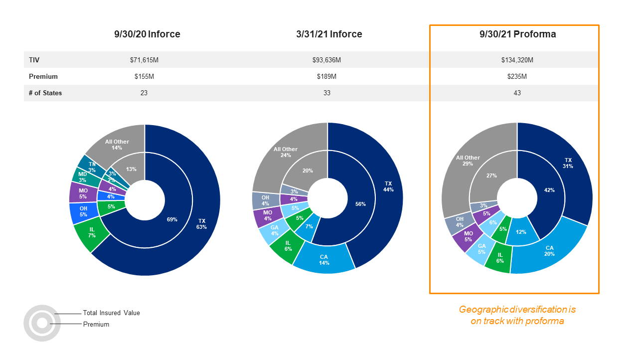
Achieving Geographic Diversification
Pie charts show how ideal geographic diversification will be achieved by September 2021. Diversification is visualized in terms of Total Insured Value (TIV) and premium.
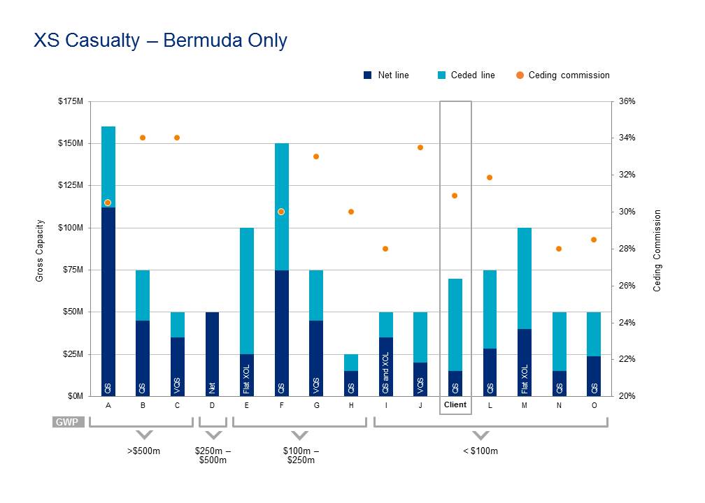
Reinsurance Capacity Peer Comparison
This chart was designed to help our client visualize how they compare to several peers in terms of the type of reinsurance they buy, how much they buy, and ceding commission made. First, we compare the client with its peers in terms of gross capacity. This includes the amount of risk retained in dark blue and the amount of risk ceded to reinsurance in bright blue. An overlay of each company’s ceding commission is represented by the orange dots on the secondary, vertical axis. Along the primary horizontal axis, all companies are grouped into four buckets based on Gross Written Premium (GWP). Lastly, overlaying each dark blue bar are the acronyms that tell us what type of reinsurance structure each company buys (QS=Quota Share, VQS= Variable Quota Share, XOL= Excess of Loss and Net, meaning all risk is retained.)
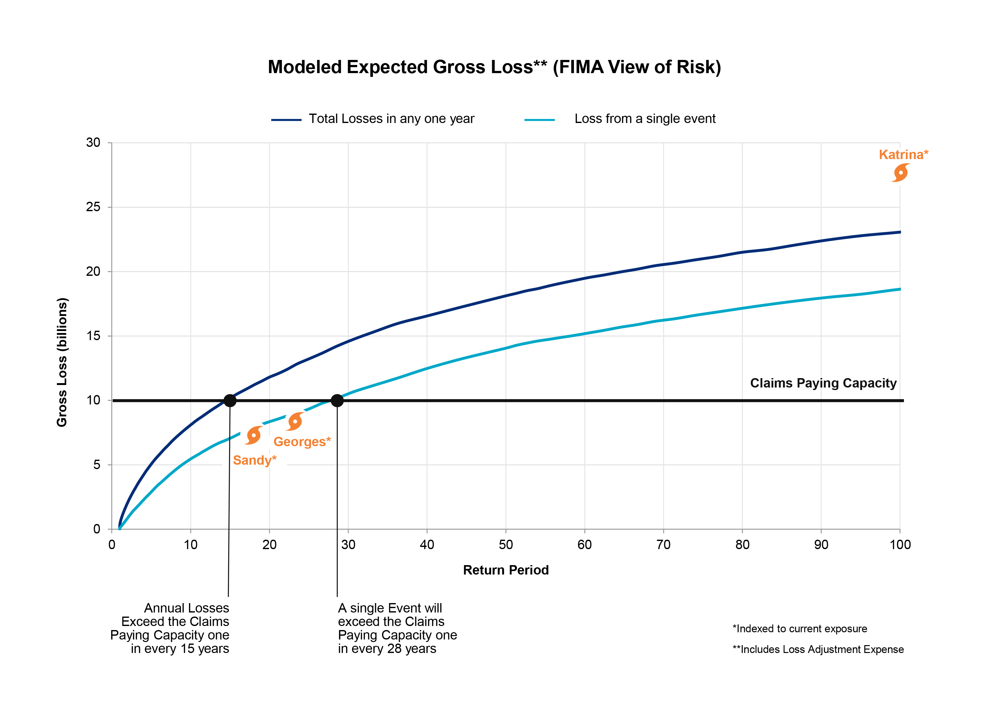
Hurricane Expected Gross Loss
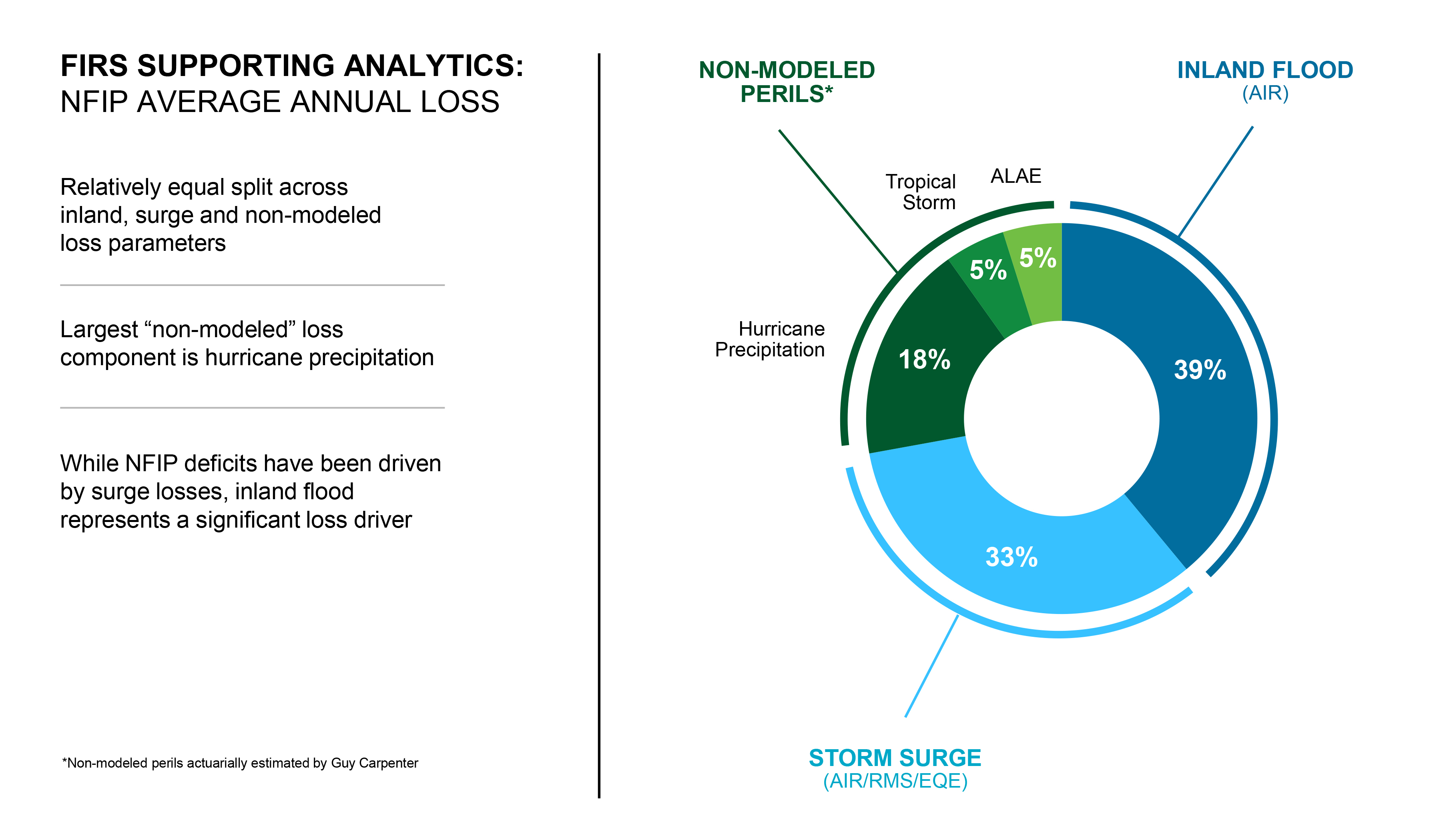
Flood Average Annual Loss
